Caelum:
XV — XVII Century
A type design project that reinterprets typefaces used between the 15th and 17th centuries through a contemporary and distinctive visual language.
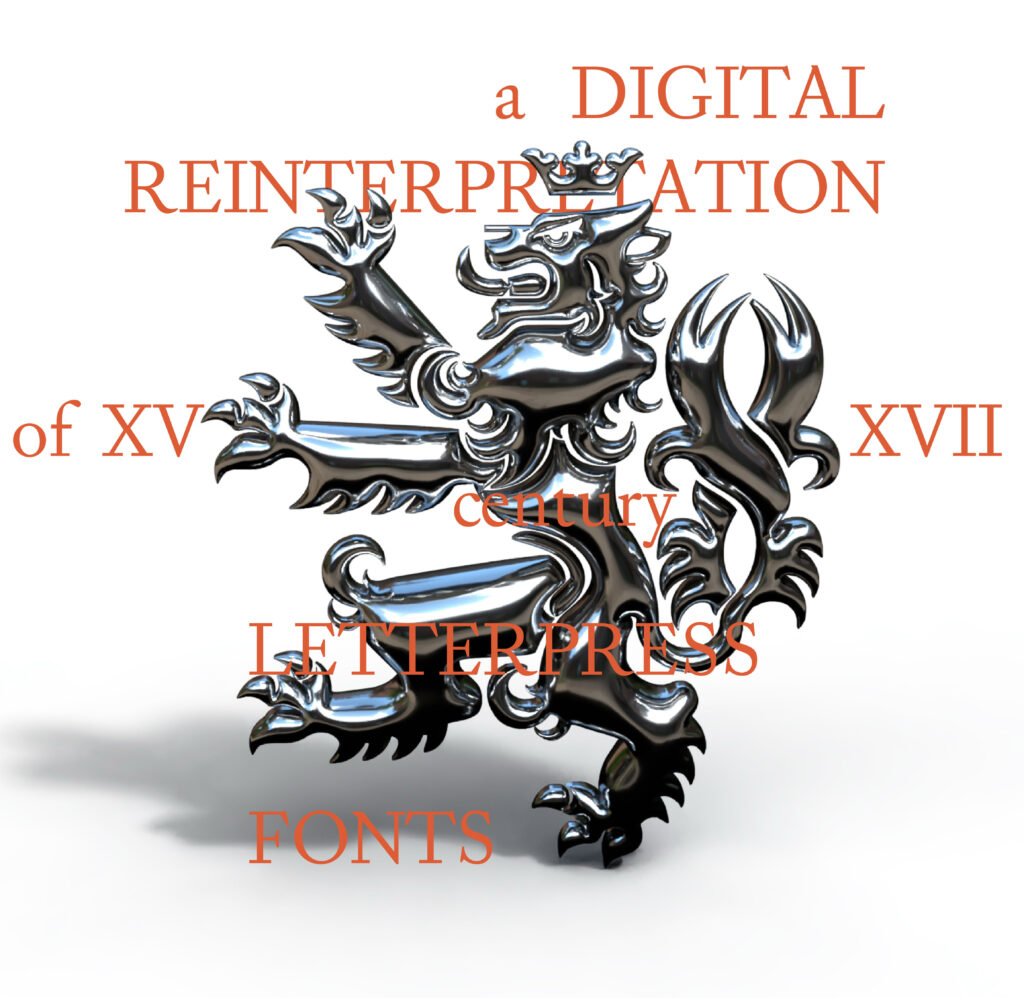
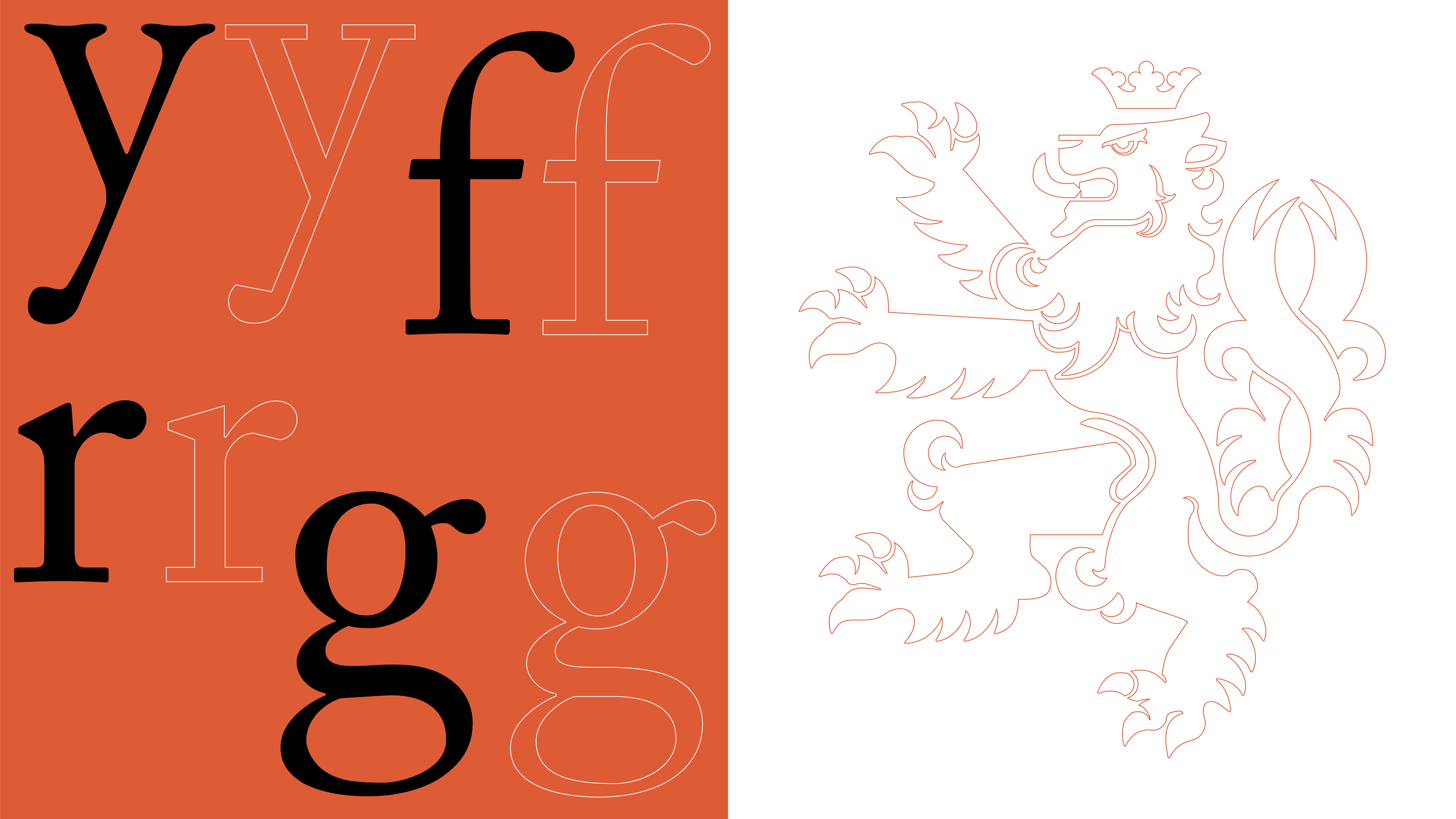
Caelum is a type design project that reinterprets typefaces used between the 15th and 17th centuries through a contemporary and distinctive visual language. Drawing from Garamond, its forms were developed by observing the material qualities and irregularities of historical metal type, later translated and refined digitally. The typeface balances the character of historical typography with greater precision and confidence, creating a more dynamic and versatile result. Its distinctive mark is a heraldic lion inspired by the coat of arms of Ventimiglia, connecting the typeface to its seventeenth-century imagery and historical references.
Caelum is a type design project that reinterprets typefaces used between the 15th and 17th centuries through a contemporary, dynamic, and distinctive visual language. Its forms draw primarily from Garamond, used as starting points for developing a new interpretation of historical typography intended for contemporary use.
The design process began with the observation of metal type and its natural irregularities, resulting from casting, wear, and the printing process. These imperfections were then translated and refined within the digital environment, where the initially more material and unpredictable forms were progressively defined while preserving the human character of the historical typefaces that inspired them.
The typeface’s identity is completed by a heraldic lion from the coat of arms of Ventimiglia, a symbol of strength, pride, and nobility, used as a distinctive element and reference to its seventeenth-century historical imagery. Caelum therefore establishes a dialogue between typographic heritage and contemporary design, creating a versatile typeface for editorial design, visual identities, and graphic communication.