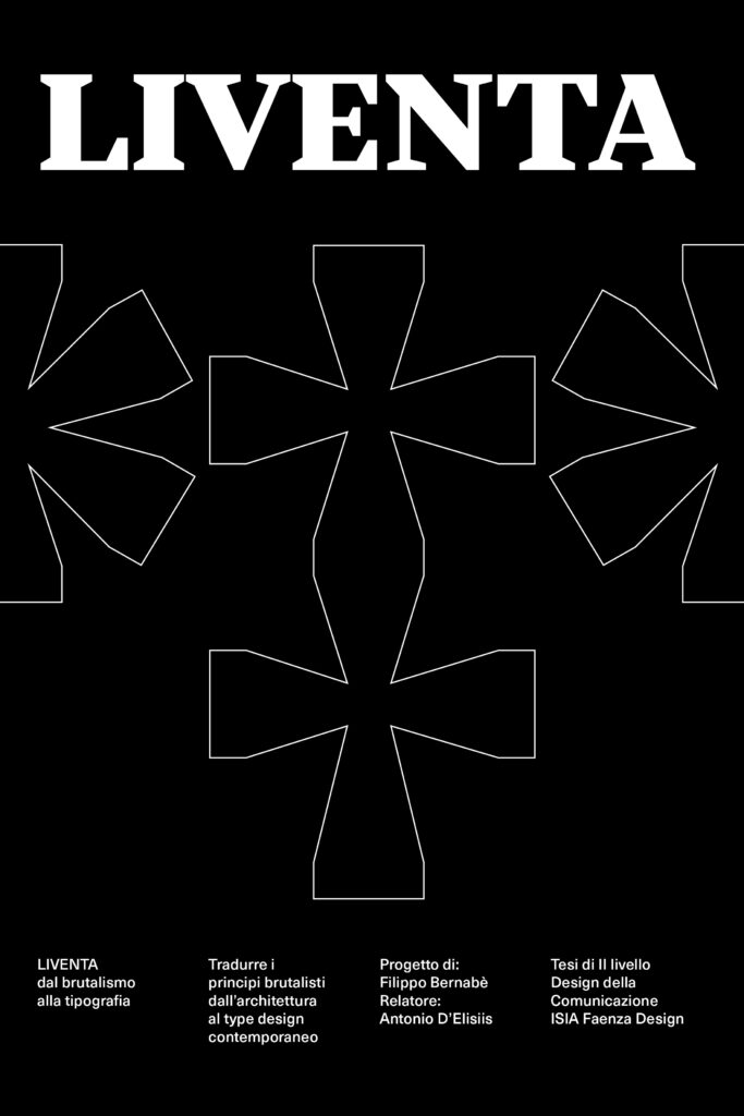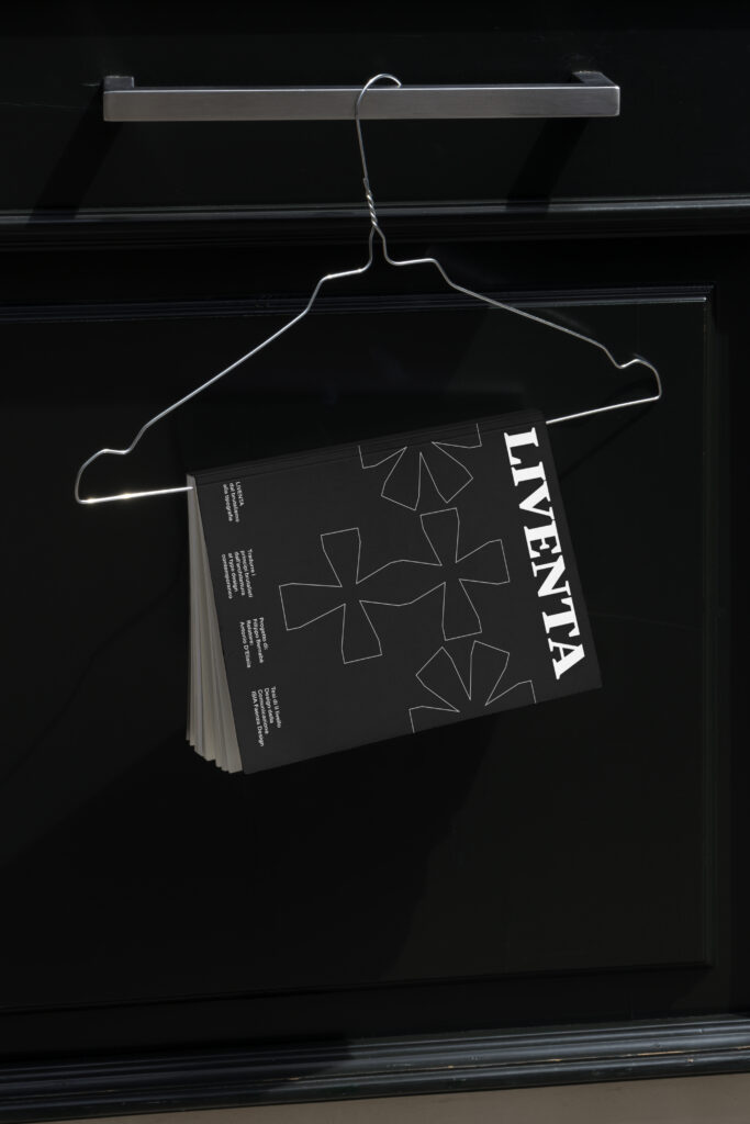
LIVENTA
dal brutalismo alla tipografia
This thesis investigates the relationship between typography and Brutalist architecture through a theoretical and practice-based research, centered on analyzing and extracting the movement’s foundational principles
LIVENTA dal brutalismo alla tipografia
This thesis investigates the relationship between typography and Brutalist architecture through a theoretical and practice-based research, centered on analyzing and extracting the movement’s foundational principles. The primary goal is not the sole production of a typographic artifact, but rather the construction of a conscious design methodology based on a critical observation of Brutalism beyond its aesthetic dimension.
The research explores themes such as formal reduction, functionality, honesty of materials, and tension between rigor and harmony, translating them into operational criteria applicable to type design. The outcome of this journey is the creation of a typeface family conceived as the direct output of the research: an open system designed for future expansions and variations.
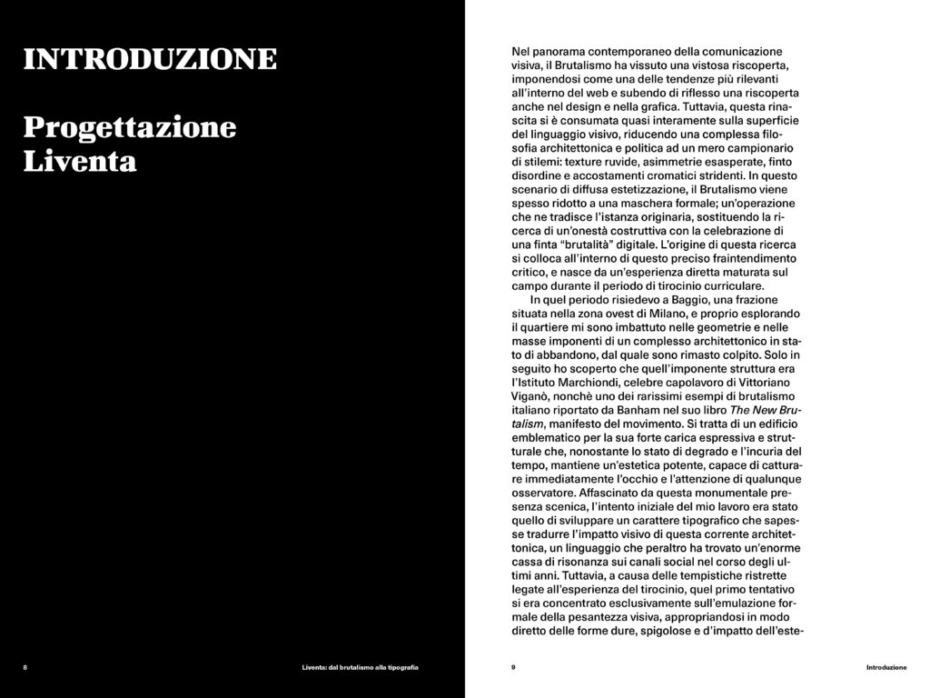
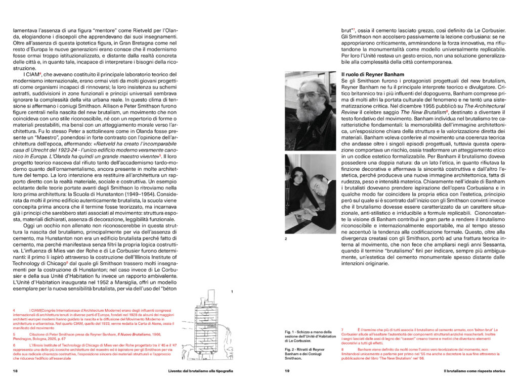
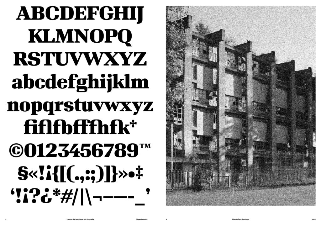
Liventa was born during my internship at Landor Milan’s type foundry, from an initial interest in Brutalism and its strong presence in Milan’s architectural landscape. While exploring Baggio during my internship, I came across the Marchiondi Institute by Vittoriano Viganò, a building that struck me for the monumentality of its forms, the strength of its masses, and the direct way in which its structure and materials are exposed. This experience led me to explore the idea of translating the visual impact of Brutalist architecture into a typeface. The first approach, developed during the internship, focused mainly on formal aspects: heavy, geometric, and highly expressive shapes. However, the research I later developed for my thesis led me to question this initial result. By studying the history of Brutalism, particularly through the work of Reyner Banham, I came to understand that its identity does not simply lie in the raw and monumental appearance of its buildings, but in a specific design attitude based on structural honesty, the exposure of construction, and the reduction of unnecessary elements. From this point, the project took a new direction.
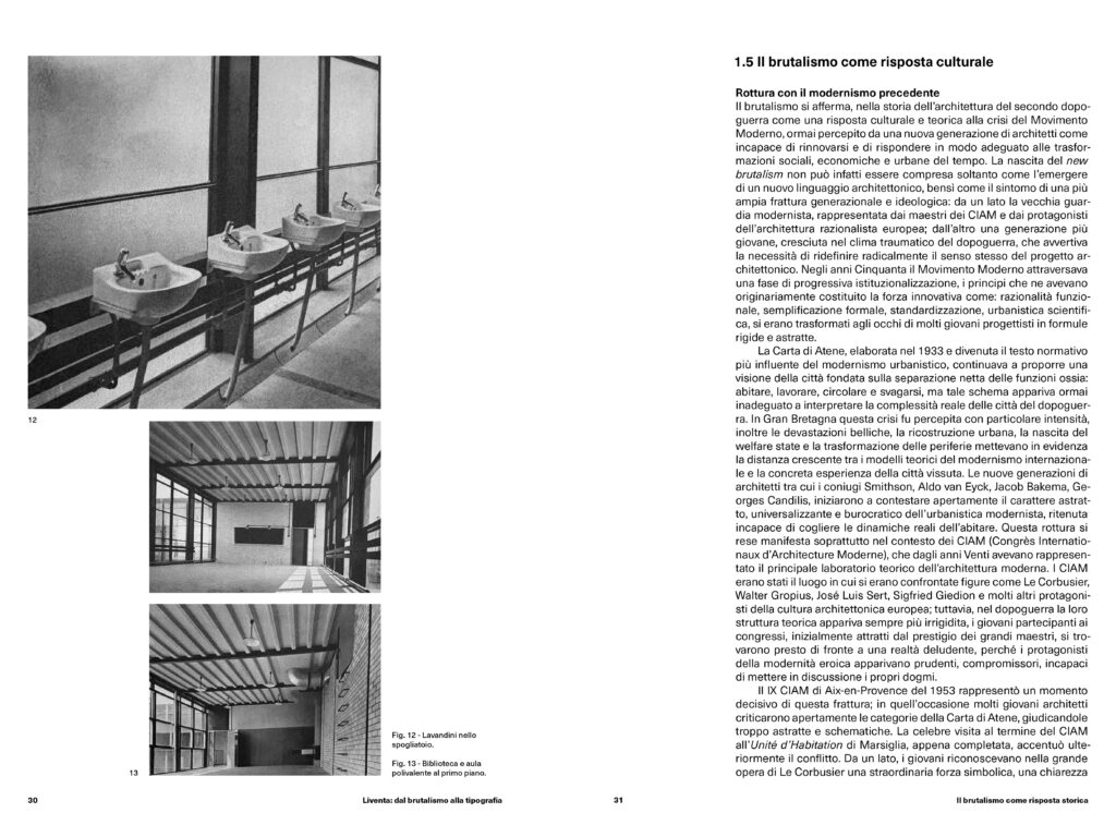
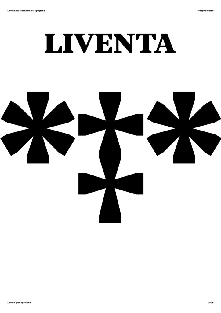
The goal was no longer to imitate the appearance of concrete or reproduce a Brutalist aesthetic graphically, but to understand how some of its principles could be translated into type design. The research therefore focused on the relationship between structure, proportion, positive and negative space, exploring how the shape of each character could result from coherent design decisions rather than from purely decorative solutions. During this phase, I also analysed several typographic and design references, connecting Brutalism with the design culture that emerged in the post-war period. The rationality of the Swiss School, the methodology of Otl Aicher, the geometric precision of Walter Ballmer, and the industrial approach of designers such as Dieter Rams helped build a network of references connecting architecture, design, and typography. At the same time, contemporary typefaces such as Signifier and Druk allowed me to explore different ways in which type can develop a strong and monumental presence.
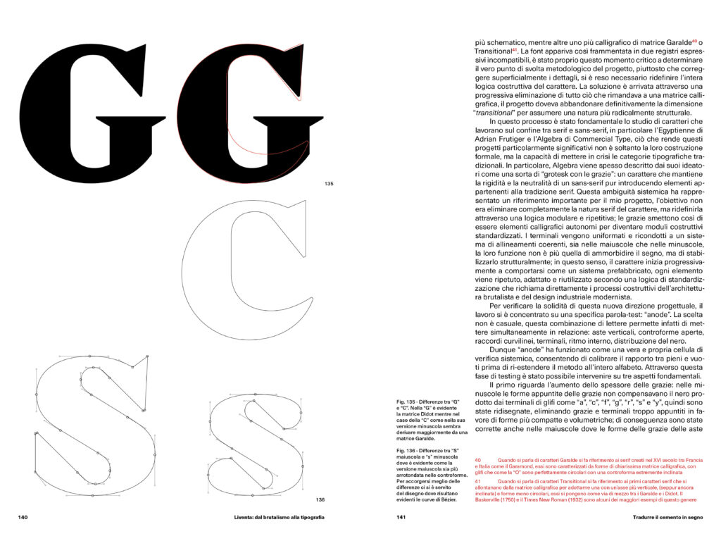
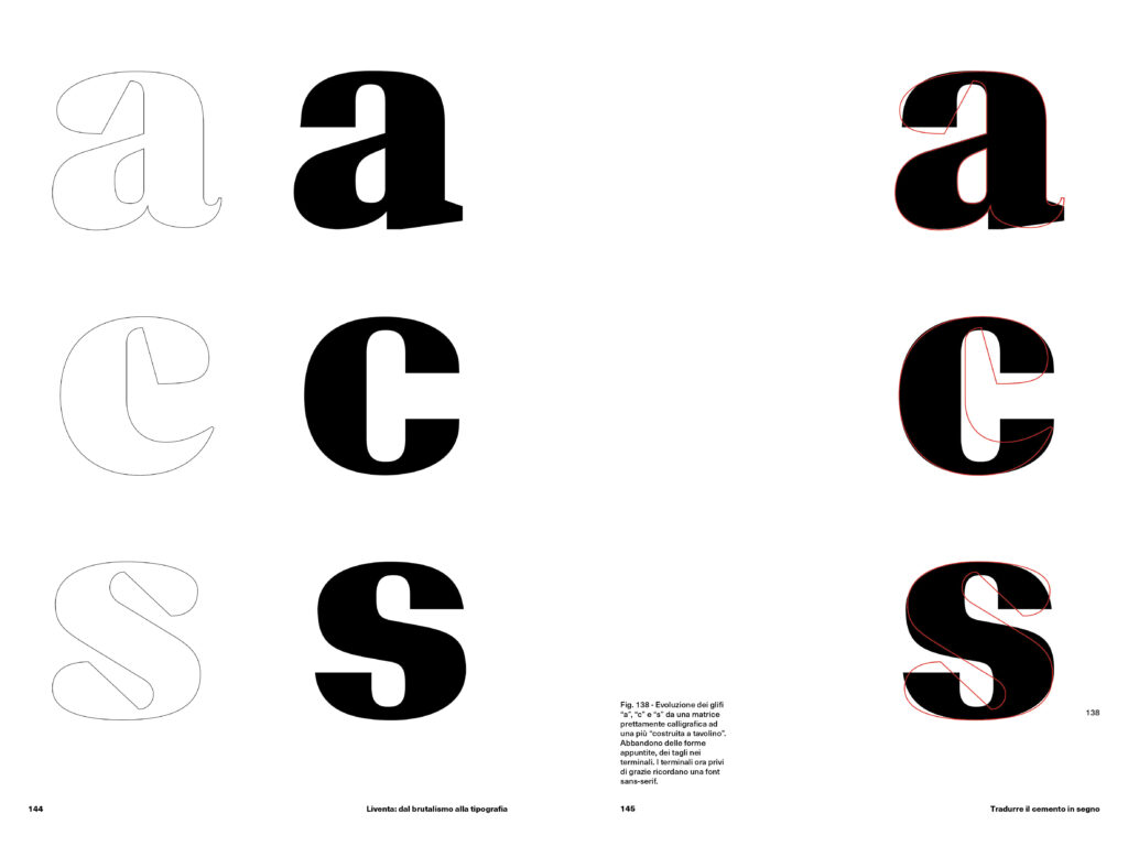
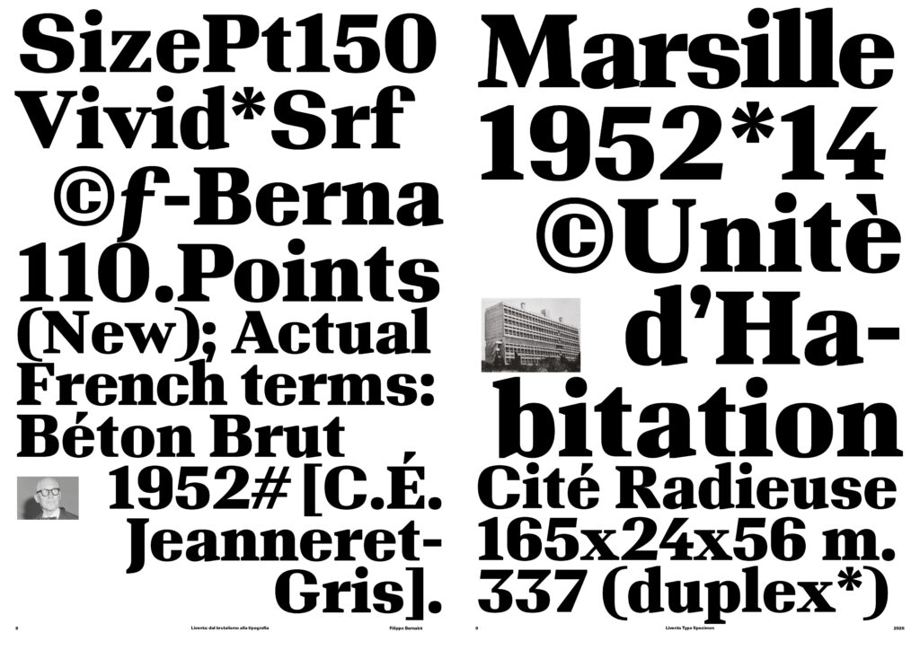
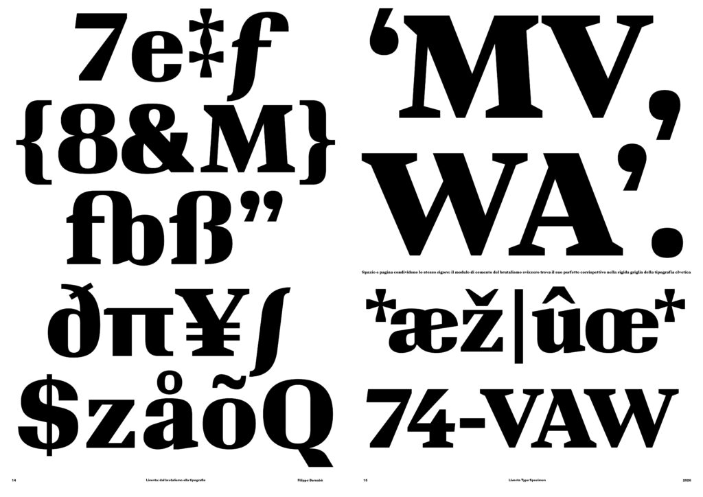
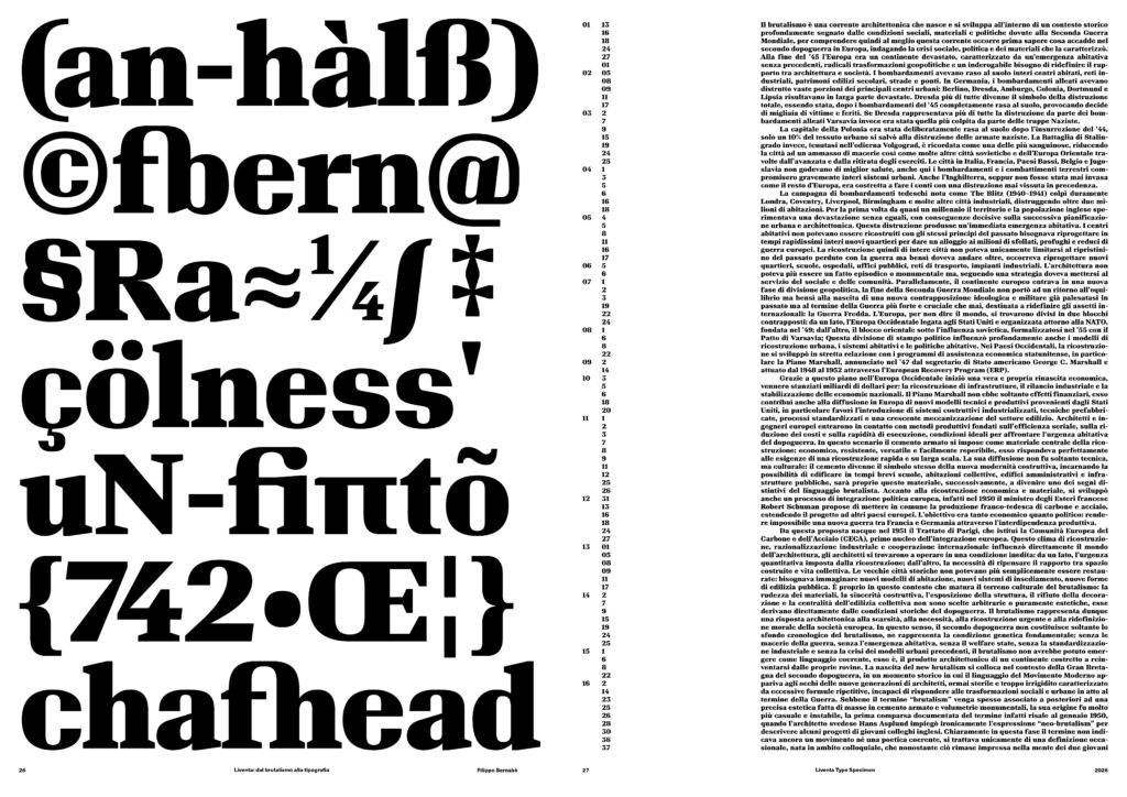
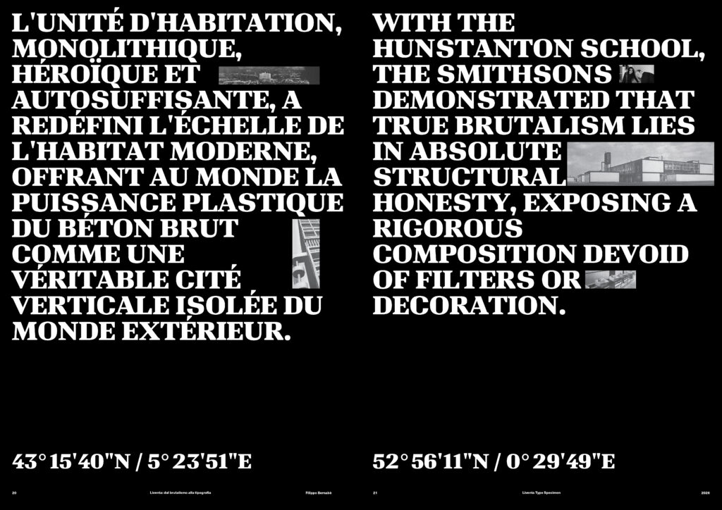
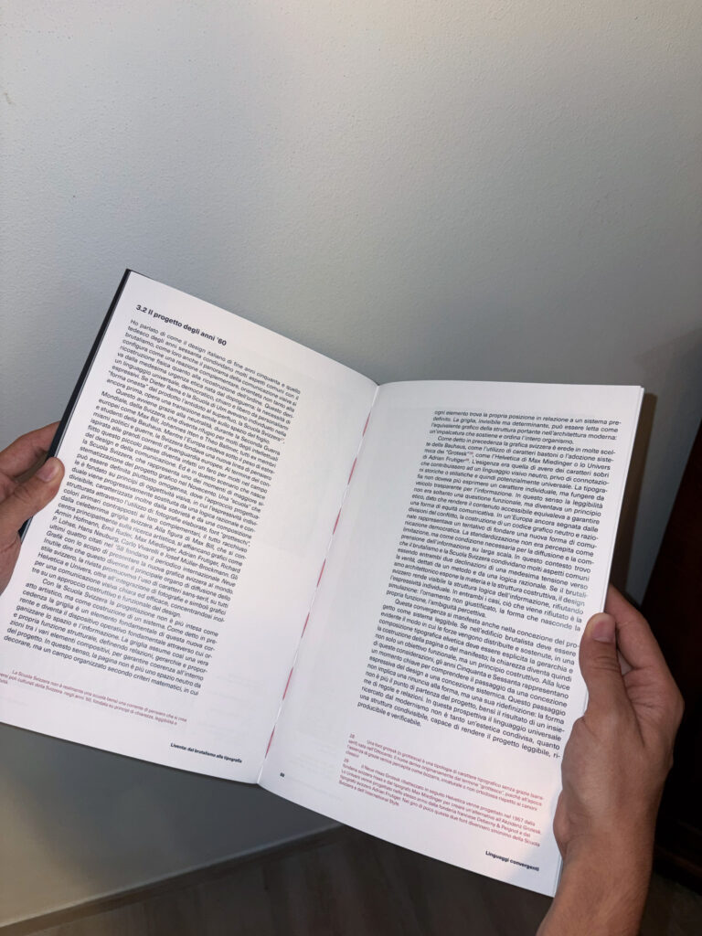
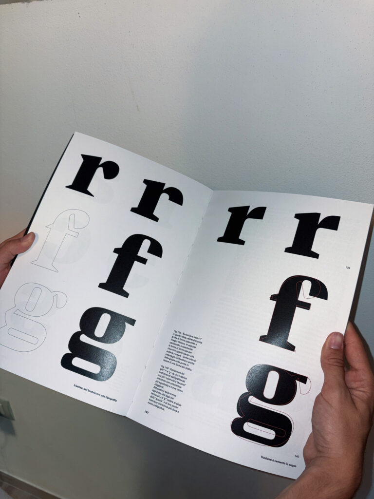
The result of this research is Liventa, a display typeface initially developed in a Black weight. Its forms are characterised by dense typographic masses, controlled curves, sharp joints, and an extremely tight relationship between glyphs. The reduced spacing makes the white space between letters an active part of the composition, creating a sense of visual continuity that recalls the relationship between solid and void in Brutalist architecture. The typeface is currently being expanded, with the Black weight serving as the experimental core from which to develop a broader family. The thesis project is further developed through an editorial layout documenting the research and design process, together with a dedicated specimen designed to showcase the typeface’s formal characteristics and possible applications.